In my last post I talked about my role as a Make Up Artist on the short film Crossed Paths. I talked about how I created make up effects for each of the two leads and gave a brief synopsis of the film, which was made by young people in Crawley.
I also worked as the Art Director for the film, making key props and dressing the locations. A lot of the action in the film takes place in a small square with shops and a pub where the characters hang out.
One scene required filming in a shop where Aaron gets a job. We were lucky to find a shop in the square where we were shooting that allowed us to film on their premises over night. The shop was closing down and the owners agreed to leave behind their remaining stock for us.
There wasn’t enough stock to fill the shop, which was a bit of a challenge, but I managed to fill the front of the shop, the till area and a central aisle. It was a good couple of hours of shuffling stock around while the crew filmed scenes outside. As often happens with set and props work, the crew only ended up using a portion of the set but I was very happy with how it all looked under the lights.
Aaron’s neighbour Hasan has given him a job in his shop, but they soon come to blows over Aaron’s growing right wing views. When Aaron’s new friend and N.E.M. member Joe asks Aaron to post flyers about their march in Hasan’s shop, Hasan objects and Aaron quits.
We used a local pub as the meeting place for the N.E.M. which was conveniently located in the same square as the majority of our shooting, in Gossops Green. The close proximity of our locations lent itself to the sense of confinement and the intensity of these different cultural groups struggling to live side by side.
The staff of the Windmill Pub were extremely accommodating and nothing like the scary looking thugs we filled their pub with. The pub was already decked out in England flags, which made for a perfect backdrop for the N.E.M. meetings. My work at this location consisted of lighting the scenes and rearranging the pub’s interior to accommodate our equipment and make the most of the location. I repositioned a lot of the furniture and decorations to suit the blocking of each scene, added some more patriotic embellishments and filled the pub with N.E.M. flyers, advertising the march.
We first see the pub when Aaron meets Joe and they go for a pint. Joe is in a similar position to Aaron, out of work and angry at the lack of opportunities. He tells Aaron about the N.E.M. who blame immigration and multiculturalism for the lack of jobs. Joe takes Aaron under his wing and encourages him to come to the next meeting.
In the next scene at the pub we see Aaron becoming indoctrinated into the group as the N.E.M.’s leader rallies them for the march. It was a tough scene to shoot as the interior of the pub was quite dark and the number of wide shots necessary to show the whole group meant that we were limited as to where we could place our lights.
As the N.E.M. are preparing to march, a group of college students plan a counter-demonstration to oppose the right wing group. We filmed the scene in the canteen of Central Sussex College in Crawley.
I decorated the canteen using Stop the N.E.M. flyers, which the protest organiser also hands out during the scene. I created a range of placards for the protest scene, some of which I left unfinished and placed around the canteen along with marker pens, paint and brushes so that our extras could be seen working on them. I also created a large banner to be used later at the protest, which I hung as a backdrop.
The action of the film all builds up to the day of the protest when all of these groups face off against each other.
As this was a Council funded projected we were able to close the roads where we were filming, which was great. It also meant that we had police officers with vehicles on hand who were happy to participate, which really added to the look and feel of the scene.
I made a range of banners and placards for the protest scene, some of which were also used in the earlier canteen scene. I wanted the various signs to look homemade and so I used fairly cheap materials. I also tried to create a difference in style between those belonging to the N.E.M. and those belonging to the students.
It was a strange experience creating protest signs for both sides of the protest, a bit like having split personalities – switching from extreme right-wing hate-speak one minute to anti-fascist imagery the next. I was also a bit worried about what my neighbours would think when I had to leave a lot of the placards outside to dry.
The film was used as part of an anti-extremism project by Crawley Borough Council. It was distributed to schools along with an education pack to help teachers explore the issues raised by the film. The pack also contained further interviews with the characters, which lent more context to the story.
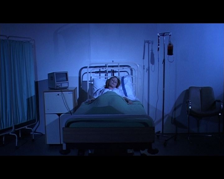
In November 2010 I worked on the short film Crossed Paths as a Make Up Artist and Art Director. The film was made by young people and was funded by Crawley Borough Council as part of an anti-extremism project. The story focuses on two young men, Aaron and Yusuf, whose combined fates are set in motion by an act of violence when Yusuf attacks Aaron in the street with a knife, landing himself in prison and Aaron in the hospital.
The action picks up some time later, when Yusef is released from prison. Aaron, meanwhile, is struggling to get back on his feet after the attack, which has left him permanently scarred. After a failed job interview he meets a member of the New English Movement, who blame the town’s multiculturalism for the lack of opportunities for young men like Aaron. Angry and disillusioned, Aaron gets swept up in the group’s dangerous ideology.
I created Aaron’s scar using On Skin Silicone and applied it with a Principality Dispensing Gun. The silicone comes in a range of skin tones which need to be powdered after they are dry in order to reduce the shine and blend into the surrounding skin.
As we filmed over several days, it was important to recreate the scar as accurately as possible on a daily basis, sometimes twice a day if it was knocked or peeling. I always take as many photos as possible so that I can keep a record of the look and to maintain continuity.
Yusuf goes through a lot of changes in prison and tries to overcome his violent past by becoming absorbed in his Islamic faith. However, this change is not necessarily for the better as it soon becomes clear that Yusuf has developed some extremist views and has been under the influence of some dangerous people. Yusuf takes to his renewed faith with a dangerous fervour and begins to recruit other community members to his cause.
Rishi, the actor playing Yusuf, was not permitted by his work to grow a beard for the role and so I had to apply a fake beard for him twice a day on location. This was my first time using beards and our schedule and budget didn’t allow for any practise time. I had to apply the beard for the first time on our first day of shooting with very little time to spare. It was a challenge, but I was pleased with the results.
I used a fake beard that was attached to a fine mesh net. The beard had to be glued on using spirit gum and then trimmed.
The action builds to a clash between various sectors of society as the New English Movement organises a march through a Muslim neighbourhood. A group of students stage a demonstration to show their opposition to the march and Yusuf organises a group to fight back against the N.E.M. As events spiral out of control, Yusuf and Aaron cross paths once again, with tragic results.
I’ll talk about my role as an Art Director on the production in my next post. In the meantime you can watch the full film below.
The third and final First Light funded Worthing Youth Media project was the animated short film Happy Cloud. I ran this project, leading workshops that took the group through the process of developing their idea into a finished film. I helped the group to write and edit their script, design the characters, draw up storyboards and put together an animatic, then led them through animation workshops before the shooting of the film itself. In this post I’ll be discussing the look and style of the film, as well as showing you some of the initial character designs.
Happy Cloud was an idea that went through a lot of development. It was originally a short project that I ran workshops for in the summer term of 2008, but when the group’s application for First Light funding was successful, they decided to develop it further.
The original Happy Cloud was a short viral ad in which Happy Cloud smiled gleefully while a narrator spoke to him in voice over. The group had to develop the character in order to find a story for their film. The concept that they settled upon was the idea of a show within a show. Happy Cloud became the star of a children’s television series.
We animated the film using paper cut out animation techniques. We created backdrops and characters using bits of paper, plastic and fabric that we manipulated and swapped between each shot. The whole film has a flat, simplistic style. I really enjoy paper cut out animation as you have to think in different dimensions to stop motion puppetry. Although it looks easier, there are far less options available to you for movement and so bringing things to life can be quite a challenge.
The idea for Happy Cloud’s TV show was to create a playful and colourful world in the style of narrated cartoons such as the Mr Men and Mr Benn. The group decided that this would be a pastiche of children’s TV’s patronising tone and inane characters. We designed a title sequence for the show that would introduce the characters and the premise of Happy Cloud’s TV show and serve as an intro for our film, before pulling back to reveal the set, leading the audience into the ‘real’ world of the film.
Happy Cloud’s narrator speaks over the titles describing Cloud Land as the happiest place in the world, where ‘Happy Cloud makes everyone happy.’ To demonstrate Happy Cloud’s powers, we designed a factory conveyor belt of people forcibly being made happy one by one by Happy Cloud. We wanted to establish the subversive tone of the humour from the outset.
Happy Cloud’s character also needed fleshing out. A cloud who is happy isn’t much to work with. With that in mind the group thought about subverting the idea. They decided that to the viewers of his show Happy Cloud would seem like the perfect role model for children, but only until the cameras stopped rolling.
Offscreen, Happy Cloud is the pampered star of the show – grumpy, vain, money hungry, alcoholic and demanding. We created three different sizes of Happy Cloud to allow us to alter his proportions to suit each shot’s requirements.
We then turned our attention to developing a cast of characters around Happy Cloud. The first was his costar and onscreen nemesis Storm Cloud. We designed Storm Cloud as a foil for Happy Cloud. Storm Cloud looks tough but isn’t. He is a somewhat depressive character who gets pushed around by Happy Cloud.
Next we designed the Director of the show. The Director is the voice of authority for the characters, almost a parent figure. We decided to only show him in silhouette to give him a mysterious anonymity.
The main conflict of the film comes into play when the Director brings in an image consultant to give the show a ratings boosting makeover. He introduces Jiggy Bigwig, an enthusiastic character who claims to be down with the kids.
The team had a lot of fun writing and designing Jiggy’s character. They envisioned a man who wears clothes that are far too young for him, tries to act like he is still a kid but is hopelessly outdated and clueless.
One of Jiggy’s quirks is his attempts to speak like young people so we made a point of highlighting some of his jargon in cut-away shots.
Happy Cloud hates Jiggy but is convinced to accept his input when the Director hints that it could lead to more money and awards for the show. Then there is an accident on set which sends Happy Cloud crashing through the stage.
Unconscious, Happy Cloud has an out of body experience, floating up from the stage as a ghostly form of himself. We had fun designing the Ghost Happy Cloud, who we made out of translucent paper to give him an ethereal quality.
He meets Zany Funhouse, the awards fairy, who acts as his ghost of Christmas future. Zany was partly modelled on Amy Winehouse (this was 2009) and styled as a partied out veteran of awards ceremonies with a tall beehive of hair that’s full of trophies and awards statues.
We decided to introduce Zany with a slow tilt, travelling up and up and up to emphasise the height of her hair. The hair was a character in itself, so we decided that for an added punchline we’d make it exactly that, giving it a face and making it growl and jump off of her head at the end of the shot.
Zany waves her magic wand and whisks Ghost Happy Cloud away to see a vision of his future. Ghost Happy Cloud finds himself at a glitzy awards ceremony, watching his future self arrive in a limo. This is my favourite shot in the film, as drunken Happy Cloud tumbles out of the limo. Happy Cloud’s anarchic behaviour was great fun to film. One of the features of the red carpet scene was the paparazzi, snapping pictures at the side of the red carpet. We designed something very simple of this, using two rows of people and then moving silver paper in and out of each frame to represent the camera flashes. The group used the opportunity of the awards audience to make nods to some familiar cartoon characters.
Paper cut out animation works by moving pieces of paper, or changing and substituting them frame by frame. Substitution is particularly effective for facial expressions and dialogue. We had a range of eyes, eyebrows and mouths in different expressions and mouth shapes for each character which we then duplicated for each different sized version of the characters.
The shots below show a drunken Happy Cloud falling asleep at the awards ceremony.
With Happy Cloud asleep, Storm Cloud has to accept the award on Happy Cloud’s behalf, but just as he is doing this, Happy Cloud wakes up and storms the stage, hurling abuse at Storm Cloud and the shocked audience.
Then, to make matters worse, he throws up.
I was delighted when Happy Cloud won the award for Best Comedy at the First Light Movie Awards 2010. We attended the ceremony at the Odeon Leicester Square, where the award was presented to our young filmmakers by Bill Nighy and Nick Frost. Thanks to First Light, the film has been screened at film festivals around the world and picked up the Small Film Award at Canterbury Anifest 2010.
If you want to see more from behind the scenes then have a look at how the finished film compares to the animatic. The opening sequence in particular is very close to how we shot the finished version.
An animatic is when you put your storyboard together on a timeline. It can include test shots and sound, although we recorded our sound after the animation shoot. On a larger production the animatic can be used to fill in gaps when full scenes haven’t been shot yet. You might notice shots in the animatic that weren’t included in the film. This is because we had to cut a couple of scenes from the script to fit our shooting schedule.
When Worthing Youth Media received funding from First Light, we made three very different short films. The zombie film Outbreak, which I have discussed in previousposts, the animated comedy Happy Cloud, which I will explore in my next post, and the moving drama Teenager. Teenager is the story of Sidney, a 15 year old boy trying to make decisions about his future whilst struggling with a difficult home life. The film was much darker in tone than the other two projects, dealing with issues of alcoholism, drug use and domestic violence.
As with Outbreak, I worked with the Art Department sourcing props and costumes, and dressing the set. In contrast to Outbreak, this film required a level of realism. The key was to make the family’s flat look lived in – food in the cupboards, clothes in the wardrobes, family photos (see opening credits) and also convey the general disarray of their lives. The cinematography of the film followed the action very tightly inside the flat. It’s a very claustrophobic place. As such, the set details had to be subtle, to provide a lifelike backdrop without detracting attention from the story.
You can learn a lot about characters from the environment they inhabit and so it is important to dress spaces to reflect the personalities of the characters, as you can see from the screenshots below of Sidney and Cassie’s bedrooms.
I was also the makeup artist for the film, and my main job on set was to create injuries for Sidney’s mother, Ann, played by Alison Vermeeren.
The film begins in the wake of a big fight between Ann and Sidney’s stepfather Daniel (played by Andrew Elias) in which she has been badly beaten. The script specifies that Ann has a black eye after the fight, and severe bruises.
To create the effects for the film I used a bruise wheel and fresh scab, which are the most versatile items in my makeup kit. The initial look was intended to be the most shocking. I used red tones to create a swollen look around the eye, forehead and mouth. Applying fresh scab with a paintbrush and stipple sponge I created the illusion of grazing on the nose, brow and cheekbones. When someone is punched hard in the face, the skin tends to break around the areas where bone protrudes, such as the bridge of the nose, the cheekbones and the brow. I also used the scab to give Ann a nosebleed and a broken lip.
In the above shots from the makeup room the colours look very bright, but they looked more subtle onscreen as the film was shot with a low exposure and was given a muted colour grading in post production.
It is evident in the script that this is not the first time that Sidney’s parents have fought like this, so I also worked to create a range of older looking bruises on Alison’s arms. The bruise wheel is very effective for blending colours to create different stages of bruise, and can also be used very faintly to create old bruises that appear to be healing. I painted bruises onto Alison’s neck, collarbone and arms, including bruising patterns such as marks from being grabbed or held firmly.
The challenge with the makeup for Teenager was that the main action of the film takes place across a period of about two weeks, meaning that the injuries sustained in the first scene needed to be shown to be healing in each new scene.
The first makeup change was very slight, as it was for a scene the next morning. I reduced the redness of the bruising around the eye and the mouth to reduce the visible sting of the injury. I toned down the highlights within the bruise around the eye, then deepened the purple to show the bruise developing as well as blending it out more around the edges and mixing in dull mustard colours. I used red eyeliner to make the eye look sore and the eyelids puffy. I also decreased the bloodiness of the grazes around the mouth, eyebrow and nose, as Sidney’s mother would have had time to clean herself up by this point.
The next scene involving Sidney’s mother takes place a few days later. For this I reduced the severity of the bruise a great deal by reducing the size of it and the intensity of the colours. I used a lighter layer of the purple, darkening it in the corner of the eye and blending out from that point, before adding yellow and a touch of green. I developed the grazes into scabs that frame the injury along the main points of impact and reduced the swelling around the lips.
A scene from later that day features another fight between Daniel and Ann, which leaves Ann bleeding. The crew filmed the majority of Teenager‘s scenes in long takes, so Alison had to keep the blood in her mouth until the end of the scene for when her lip begins to bleed. I had to stand behind the camera with the blood so that she could take a swig between takes.
The final appearance of Sidney’s mother is in a montage at the close of the film. The scene takes place some time later, perhaps a matter of weeks. The bruises seen earlier in the film have healed but she has clearly obtained more. I created a bruise on the forehead as if she had hit her head falling over, a bruise to look like a blow to the chin, subtle bruising around the eyes and another bloody lip.
The makeup room is usually a fun place to be on set. Transforming people’s looks can be a real novelty, especially working on something extreme like a zombie film. This was quite a different experience, though. Once I finished Alison’s makeup on the first morning it had quite a sobering effect on everyone. This wasn’t extreme gore or slapstick, it was a serious film about things that really happen to people. It was quite unpleasant to depict suffering in that way. We were only playing at it, but there are a lot of people in the world who are living with abuse, and carrying bruises that they can’t wash off at the end of the day.
In my last post I talked about making props for the short film Outbreak with Worthing Youth Media. Now I am going to discuss in more detail how we designed and created specific character looks for our zombies. I’m a HUGE fan of George A. Romero, so working on this short was a dream come true for me.
The first consideration was to populate the film with zombies who represented a cross section of society, the Zombie Apocalypse is coming for all of us, after all. During preproduction for the film I was like Simon Pegg in the opening scenes of Shaun of the Dead, imagining the slow zombification of the world unfolding around me. I started working on a sketchbook of zombie characters, and encouraged my art department team to do the same. In order to create characters, I encouraged the team to consider who this person was before they were bitten, how and where they had died, how long ago they had turned and what their zombie self might have encountered since as all of these things can be conveyed by the zombie’s appearance.
As we moved closer to the shoot, we began shortlisting our zombie cast, using the action an locations of the script to help in our decisions. With our zombie cast locked down, we started sourcing the costumes that would bring our undead characters to life. Clothes and accessories were then sliced, ripped, sand-papered, dirtied up and covered in blood as we matched the outfits up to our actors.
On the first morning of the shoot, I was the go-to guy for blood. I carried three our four different types of fake blood on set at all times, including two spray bottles that I used to cover actors on set before the director called action. In between takes, my team and I were on hand to reapply blood and keep wounds looking fresh. By the end of the week my hands and arms were stained red up to the elbows.
All of the zombies had a basic look that was consistent. Each zombie was painted white, with a blend of purple and mustard bruise colours around the eyes to create a decaying look. Following that, zombies were given their own individual wounds and grotesqueries. The exception to this rule, were the identical zombie twins, who were given matching mirror image misfortunes. We discussed the use of contact lenses to give the zombies that dead eyed look, however, there were a number of reasons that this wasn’t affordable, practical or safe for use with young children. Instead we used a red eyeliner to give the eyes an evil look. Although the cause of the zombie outbreak is not explained in the film, in my designs for the characters I envisioned it like a disease with the red eyeliner providing a swollen, puffy, infected look.
To add further detail I used latex to create the look of broken skin, burns and lesions. Tested here on a zombie extra. The effect is achieved by building up layers of liquid latex onto the skin and then piercing and tearing it to make holes. These holes can then be worked into with makeup to add colour and definition. I like to use black as a base to create the illusion of depth, and then add a purplish red followed by fresh scab for texture.
Zombie Chef, the script’s most intimidating zombie, required a more complicated look as he is the main antagonist of the film. We wanted to make him look scary and burned, as he met his death in a kitchen.
We started with a typical chef’s costume, which was then distressed by being torn and burnt. We wanted to exaggerate his look to make him quite extreme so we covered the outfit in food stains and blood.
Zombie Chef had one of the most complicated makeup looks in the film, made all the more difficult because his scenes were shot over two days, meaning that the makeup had to last a full day’s shooting before being recreated as exactly as possible the following morning.
I started by giving him a foundation of white skin, with purple around the eyes. I find that the eyes usually need retouching again at the end, but it helps to have a foundation to work with. I then covered the actor’s face and neck with several layers of liquid latex. The operation was time consuming as each layer of latex needed time to dry before another could be applied.
Having achieved a good layer of latex, I then ripped holes of varying sizes, using a pencil to break the latex. We took photographs of every stage so that the look could be recreated the next day. When creating the look for the second time, I referred to the previous day’s photos and used the pencil to draw onto the latex so that I knew exactly where the holes needed to be.
The next job was to add definition and shading to the holes using a variety of colours. We wanted to create a charred skin effect and so we used a lot of reds and purples to make the skin look scorched and sore, then yellow and green hues as highlights around the edges. Finally, we added texture to the wounds using fake scab again. I love using fake scab, it has a consistency like raspberry jam and it sticks to the skin and slowly dries to look like a nasty scab or graze.
The longest makeup job on set had to be the Old Lady Zombie as we needed to create a combination of zombie and ageing makeup. We decided that not only was Old Lady Zombie old, but she’d been a long time dead so we wanted her to look really decayed and grotesque.
I started out in the same way that I approached Zombie Chef’s makeup, starting with a white foundation. This time instead of applying the liquid latex directly onto the skin, I used it to apply small pieces of tissue paper all over the actress’s face and neck. As it dried, this created a leathery, wrinkled skin effect. To give a sense that her skin was rotting I then blended white, yellow and green makeup for an all over tone, before using blues and purples for depth and shading. Finally, to add to the aged and rotting effect, I used a fine paintbrush to paint veins all over her face and neck. Red eyeliner was used again to give the eyes an evil look.
As well as making up her face I also applied makeup to the actress’s hands and arms, as I knew that there would be a shot in which this character reaches through the letterbox. I covered the actress’s arms in latex, before using a sponge to apply greens, yellows and browns for a mottled, rotten look.
Old Lady Zombie was a comedy character in the original script, and although her scene was rewritten, we still wanted to keep the same sense of fun in her overall look. `The original script described her as a WI member. We chose a matching outfit for her with an ostentatious hat. The costume was then ripped and covered in the customary amount of blood, before the addition of dirt and flowers to give her that ‘Just Dug Up’ look.
It was a shame not to see more of the character in the finished film, but that’s life in the art department!
The final makeup challenge for this film was a zombie movie staple – the zombie bite: a protagonist is bitten by a zombie and we watch their slow transformation into the undead. This was my homage to Dawn Of The Dead‘s Roger. What was fun about this effect was that there were stages to the makeup that we enhanced from scene to scene.
We don’t see Derek get bitten by the zombie. First, we see that Derek is feeling unwell. This shows up better on video than as a screenshot, so check out the movie below to see the full effect. We wanted to introduce elements of the zombie design slowly and subtly, hinting at what’s yet to come. I gave the actor a light covering of the white zombie foundation, enough to make him look unnaturally pale. I also wanted to show that the change was already beginning, and so I used a mustard colour around his eyes. I thought that yellow would give the actor a sickly hue, and it is also a colour that, once blended with different shades of purple, contributed to the look of the other zombies in the film. I then created the appearance of sweat by applying glycerine with a stipple sponge. This had to be reapplied between takes to give him an unhealthy sheen and a feverish look to show signs of the infection.
At this point Derek’s zombie bite is revealed to the audience. This is the only human injury we see in the film and we wanted it to be shocking. We wanted it to look serious, definitely an injury that could kill if not seen to immediately. I went about this in the same way as the other wounds, but on a larger scale. First I used black and various purples and reds to create a bloody looking area. I created two small bones using bone wax, which were attached to the skin and covered with a layer of liquid latex to keep them looking clean and white, so that they wouldn’t soak up any of the blood. I then used tissue paper, building up a layer of latex skin over the injury which was then ripped open to expose the wound and bones beneath. I used wound filler to add texture and extra gore to the wound, and of course, plenty of fake blood. The ‘skin’ was blended into the rest of the arm using a natural foundation. As this wound was the source of the infection we wanted to make it look as if it was already rotting, so we blended yellows and greens into the skin. To further represent the zombie virus spreading into the body I painted a vein effect spreading out from around the wound.
The final stage of Derek’s transformation was to reveal him as a zombie in the climactic scene. This involved a slightly different design from our regular zombies because Derek was a protagonist so we wanted to show him as a tragic, rather than as a scary zombie. Also because Derek had only just turned, he would not look as rotten or weathered as the other zombies, and we couldn’t cover him in injuries, because he hadn’t sustained any beyond the bite to his arm. I gave him the same white face as the other zombies, then exaggerated the lines and features of the actor’s face and neck with blue shading, which I blended into the white to make the colour less bright. I then increased the yellow shading around his eyes and layered purple over it. Building on the idea of showing the virus’s spread, I designed Derek’s eye makeup to mirror the veiny style of his wound, spreading out through all of the creases around his eyes.
I love zombies, and I especially love doing zombie makeup, so watch this space for more zombie experiments and to see zombie up myself.
During my time working with Worthing Youth Media we produced the short zombie film Outbreak. The film was funded by First Light, the UK Film Council’s initiative for young filmmakers.
The film was crewed by the members of Worthing Youth Media, who were given assistance and training by mentors such as myself. For this production, I was in charge of the Art Department – running workshops in Production Design for a small team of young people, as well as sourcing locations, props and costumes, dressing the sets and working as a makeup artist on the shoot.
My favourite part of this job was working with the team to design the various zombie characters who would populate the world of the film. I’ll talk in more detail about this in my next post, as right now I want to focus on the props that I made for the film.
Obviously when you deal with zombies, you expect a certain level of gore. For certain scenes, I had to create flesh for the zombies to eat.
The first challenge, was creating entrails for our Zombie Brownie to eat in the opening scene (pictured above.). This led to some interesting home experiments!
The obvious choice was sausages. I purchased several links of sausages from the butcher and untwisted each link to make one long sausage. I then soaked the sausages in food dyes, deciding after a few tests that a combination of red and black would look just disgusting enough, and contrast well against red fake blood. Then, to add texture, I mixed food dye into liquid latex and painted it onto sections of the entrails to look like fatty tissue. I love working with latex as there are so many things you can do with it. Finally, the entrails were placed into a box of girl scout ‘cookies’ made by the props team, which we filled with blood on set.
In a later scene in the film, the heroine’s dog gets eaten by the Twin Zombies.
We see them surround the dog, and then when they reappear, they are chewing on the dog’s severed leg. It was my task to add gore to our dog’s leg prop, and create prop flesh for the zombies to chew on.
Again, I used liquid latex to create the effect. By layering the latex on tin foil I created strips, which I then treated with vinegar to create texture. The vinegar causes the latex to wrinkle, bubble and contort. The result was lots of twisted, lumpy bits of rubbery flesh, which I soaked in food dye and then arranged and layered up on the dog’s leg, using more coloured latex to attach it all. I also twisted some of the strips to create sinewy tendons. Once we added some fake blood on set, it was ready for filming.
The rubbery texture of the latex was perfect for the scene, as it allowed the twins to bite and stretch the fake flesh, even snapping bits off. It also produced some fantastic squelching noises. I also created a small piece of flesh for Zombie Chef to chew on in the same scene, using the same method but with less texturing effects. Here’s how it all looked on set –
The finished film was nominated for Best Drama at the First Light Awards 2010. You can see the finished product below. If you want to just skip to the gory bits, you’ll find the entrails at o:50 and the dog eating at 3:05. I’ll be talking about the various makeup effects created for the film in my next post.
For my major project at University, I wrote and directed Elysium, a short film based on the myth of Orpheus and Eurydice. The film combines live action with stop motion animation. I also designed and built sets and puppets for the film.
In the original story, Orpheus’ lover Eurydice is bitten by a snake on the day of their wedding. She dies, and Orpheus travels to the Underworld to beg Hades to return her to him. Hades agrees, but only on the condition that Orpheus leads Eurydice through the Underworld and back to the land of the living without looking at her. Orpheus finds Eurydice and leads her through the Underworld, but at the last minute he looks back to see her and she dies a second time, this time forever.
In our adaptation of the story, Chris is the Orpheus character and his wife Laura, Eurydice. Laura is in a coma and the doctors have told Chris that there is no hope of her waking up. Chris visits a strange organisation, who offer him the chance to bring Laura back by travelling into her dreams to wake her up. The real world is filmed in live action, on digital video, and the dream world is animated with stop motion puppetry.
We constructed a hospital set in the studio, using flats that we wallpapered and painted and then hiring hospital props to give it an authentic feel. We visited an amazing company in London that had a huge warehouse full of hospital equipment.
We wanted the film to have a very stylised look. As we were dealing with fantasy it was really important that the film have a dream like look and fluidity. This was the opening scene and I wanted it to be moving and enigmatic. I chose cold blue lighting and arranged it to look like a spotlight around Laura, focusing attention to the centre of the screen and making the edges of the shot shadowy and vague.The idea of this scene was to introduce Laura and her plight in a way that was heightened, as if it was Chris’s nightmare. I wanted to represent Laura as a Sleeping Beauty and suggest the danger that she is in. I decided to show this by using an imperfect match cut from the tubes in Laura’s hand to a snake coiling itself around her wrist, drawing on the imagery from the original myth.
We used a real snake for this shot. We hired it from a taxidermist. It hadn’t been stuffed yet and it was being kept in a freezer. We needed to defrost it and keep it in the fridge between takes. It smelt horrible, and it was a pretty gross thing to handle. Our actress had to be really patient and keep her hand perfectly still while we animated it frame by frame. I was really pleased with the final effect.
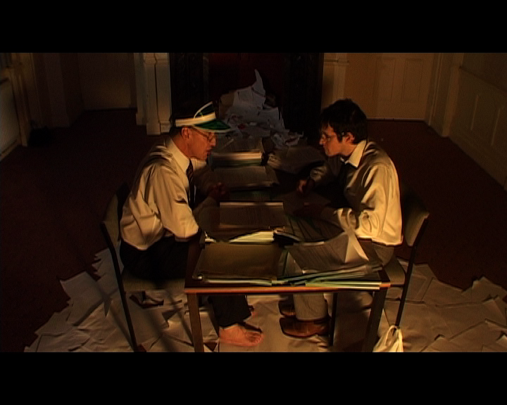
For the organisation itself I wanted to create the idea of the afterlife as an inefficient bureaucracy. I had in mind that any organisation that deals with the public en masse – the tax office, the passport office, the job centre is a place of waiting rooms, queues and endless paperwork. If there is an afterlife, then in centuries of human existence it will have been inundated with souls that would be a nightmare to process and organise. For this reason I saw the lord of the underworld as an overworked filing clerk or administrator.
The passage from the waking world into Laura’s dreams was a difficult one. Not only did the character need to cross a metaphysical plane, but we also needed to make a transition from live action to animation. I have always been attracted to the illusion of cinema and so I decided to represent Chris’s journey as a magic trick of sorts.
Later in the film we mirrored this shot with the animated Chris.
To further the magic trick imagery we built a box for Chris to climb into. We wanted to create a magic and shamanistic method by which he could make this journey, and we used images of boxes and doors being opened throughout the film.
Chris is shut inside the box with a poisonous snake. We wanted to use the snake to link Chris to Laura through this experience, and also to suggest that the snake’s venom would cause Chris to hallucinate. Chris loses consciousness, and when he wakes up, he is a puppet inside Laura’s mind.
For the first dreamscape, I wanted to create a sort of Dali-esque wasteland. This set represents the outskirts of Laura’s mind which at this stage I wanted to show as a sort of cluttered lost property of artefacts and memories. As we are now in the realms of the imagination and dealing with dream logic, I wanted to create a confused sense of scale. I also love to combine real objects with puppets when I animate which is a theme I developed throughout the sets for this section of the story.
I wanted this to clearly be a female landscape, and so I littered the set with items you might find at the bottom of a woman’s handbag. Laura’s condition throughout the film makes her a distant character, as these sets represent Laura’s internal world, they are a way to provide small character details visually.
Now that Chris has left the physical world, dream logic rules over everything and that includes the dimensions of the sets. Items move between shots and each set was designed to overlap so that we moved between scenes in a fluid way, as if dreaming. The staircase leads up to a landing where the next scene takes place. In order to overlap the two sets we built a detachable stairway into the landing set, so that it could be used for Chris to travel from one set to the other. We also tried to blend the stairway into the wasteland set, covering it in sand so that it seemed to have risen up out of the set organically.
The landing set is a deeper level of Laura’s subconscious, where we begin to see elements of her memories and dreams. The scene is actually based on a recurring nightmare I had as a child, about trying to walk along hallway without waking someone up. In the layout and lighting of the set I wanted to convey a sense of unease and tension. The landing is narrow and the bannisters of the stairs cast threatening shadows.
We constructed the base for the sets out of dense polystyrene, which I tend to use as a base for most animation sets as it is a good material for pinning the puppets into. This might be the most difficult set I’ve had to build. Firstly, it had so many dimensions, two staircases and landings that needed to be measured out and fitted together perfectly. The staircases then had to be carpeted with adhesive velvet that needed to be cut to fit, then we had to build railings and bannisters. I also needed to be able to remove one set of stairs to slot into the wasteland set for the transition from that scene to this one and in the second scene this set was used for the whole thing needed to fall apart on screen. We had to do a lot of planning and make sure we had all of the shots we needed from each scene before filming the final destruction.
The third set built for the animated segment was the nursery. This scene is probably the most abstract in the film and deals again with a combination of Laura’s dreams and memories that are difficult to interpret.
With this set we played around with scale again, using a combination of real childhood toys alongside doll’s house furniture and toys that were made to a much smaller scale. I like the strange quality it gives to everything. As we weren’t trying to represent the real world we were able to have a lot of fun with the set and characters for this scene. the Rocking Horse is my favourite puppet, which I will talk about in more detail in a later post. We also created a nightlight effect by cutting stars and crescent moons out of paper and moving it across a spotlight throughout the scene.


 We used a local pub as the meeting place for the N.E.M. which was conveniently located in the same square as the majority of our shooting, in Gossops Green. The close proximity of our locations lent itself to the sense of confinement and the intensity of these different cultural groups struggling to live side by side.


 In the next scene at the pub we see Aaron becoming indoctrinated into the group as the N.E.M.’s leader rallies them for the march. It was a tough scene to shoot as the interior of the pub was quite dark and the number of wide shots necessary to show the whole group meant that we were limited as to where we could place our lights.

 As the N.E.M. are preparing to march, a group of college students plan a counter-demonstration to oppose the right wing group. We filmed the scene in the canteen of Central Sussex College in Crawley.


 The action of the film all builds up to the day of the protest when all of these groups face off against each other.


 I made a range of banners and placards for the protest scene, some of which were also used in the earlier canteen scene. I wanted the various signs to look homemade and so I used fairly cheap materials. I also tried to create a difference in style between those belonging to the N.E.M. and those belonging to the students.


